Table of Contents
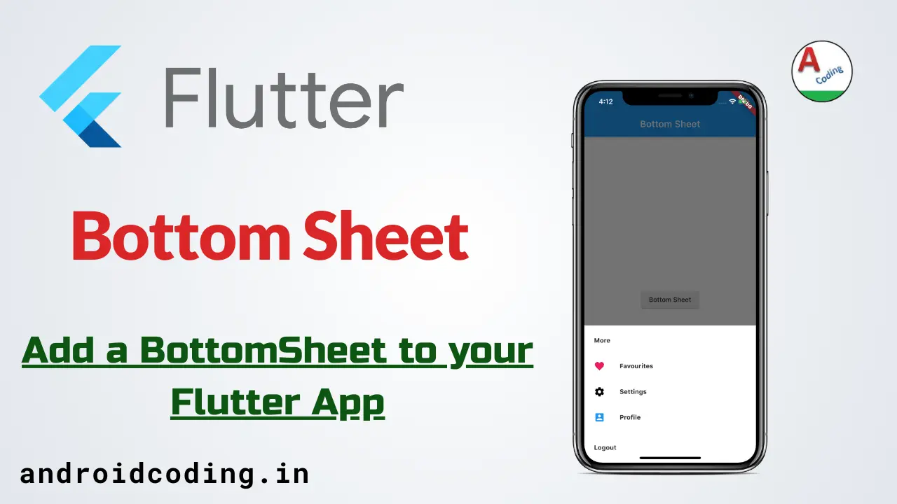
Flutter Bottom Sheet :
Flutter Bottom Sheet is a type of menu which is raised from bottom to top and has a options available for user to select.We can also add different widgets like input fields, buttons and more.
Bottom Sheet is a part of material design it provides a better user interface with a dialog view, can be designed according to the user requirement.
Bottom Sheet provides a separate view which is populated over the current screen so we can have more items populated in the available screen space.
These Bottom Sheets are easy to use for users and easily understandable for better app functionality in terms of user interface.
In this tutorial we will be seeing a simple flutter bottom sheet implementation in which we have provided a text and icon to identify it also we can specify sections as you can see in this tutorial.
How to create a Modal Bottom Sheet in Flutter
Time needed: 15 minutes
Follow these steps to implement a responsive modal bottom sheet using the showModalBottomSheet function.
- Define the Trigger
Create a button (ElevatedButton) to trigger the sheet.
- Call the Function
Use the
showModalBottomSheetmethod within theonPressedproperty. - Build the UI
Use a
builderto return a Widget (like a Column or ListView) that contains your sheet content. - Handle State
Wrap with
StatefulBuilderif you have interactive elements like checkboxes.
Flutter Bottom Sheet Video Tutorial :
This video provides a visual walkthrough of the Material Design implementation, which complements the code structures we’ve discussed for your guide.
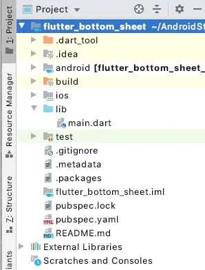
Project Structure :
This image provides the flutter bottomsheet project structure implementation.
Modal vs Persistent Bottom Sheet: Which one to use?
Choosing the right type of bottom sheet is crucial for a clean User Experience (UX). Here is a quick breakdown of the differences:
| Feature | Modal Bottom Sheet | Persistent Bottom Sheet |
| User Interaction | Blocks interaction with the rest of the app. | Allows users to interact with the main screen. |
| Dismissibility | Dismissed by tapping outside or swiping down. | Remains visible; usually integrated into the Scaffold. |
| Best For… | Menus, simple forms, or picking an option. | Media players, persistent navigation, or “Now Playing” bars. |
| Implementation | showModalBottomSheet() | Scaffold.showBottomSheet() |
Key Takeaway: Use Modal for secondary actions that require focus. Use Persistent when the info needs to stay on-screen while the user navigates the current page.
How to Implement Modal Bottom Sheet using showModalBottomSheet
The showModalBottomSheet function is the most common way to display content from the bottom. It is a built-in Flutter function that handles the animation and overlay for you.
void _showMyModal(BuildContext context) {
  showModalBottomSheet(
    context: context,
    builder: (BuildContext context) {
      return Container(
        height: 250,
        padding: const EdgeInsets.all(16.0),
        child: Column(
          children: [
            const Text('Modal Bottom Sheet', style: TextStyle(fontSize: 20, fontWeight: FontWeight.bold)),
            const SizedBox(height: 20),
            ListTile(
              leading: const Icon(Icons.share),
              title: const Text('Share'),
              onTap: () => Navigator.pop(context),
            ),
          ],
        ),
      );
    },
  );
}
Step-by-Step: Creating a Persistent Bottom Sheet
Unlike the modal version, a Persistent Bottom Sheet is tied to the Scaffold. It doesn’t block the background and is great for continuous tasks.
Assign a GlobalKey: You need a GlobalKey to reference the Scaffold.
Use the Controller: The showBottomSheet method returns a PersistentBottomSheetController, which you can use to close the sheet programmatically.
Example Snippet:
final GlobalKey<ScaffoldState> _scaffoldKey = GlobalKey<ScaffoldState>();

// Inside your Build method
ElevatedButton(
  onPressed: () {
    _scaffoldKey.currentState?.showBottomSheet(
      (context) => Container(
        height: 100,
        color: Colors.blueAccent,
        child: const Center(child: Text("I am Persistent!")),
      ),
    );
  },
  child: const Text("Open Persistent Sheet"),
)
Advanced Customization: Rounded Corners, Height, and Draggable Sheets
To make your app look professional, you often need to move beyond the default rectangular white box.
- Rounded Corners: Use the
shapeproperty to add a top-only radius. - Full-Screen Height: Set
isScrollControlled: true. This allows the sheet to take up the full screen height if your content is long. - Draggable Scrollable Sheet: If you want a sheet that “snaps” to different heights (like Google Maps), wrap your content in a
DraggableScrollableSheet.
Custom Shape Code:
showModalBottomSheet(
  context: context,
  shape: const RoundedRectangleBorder(
    borderRadius: BorderRadius.vertical(top: Radius.circular(25.0)),
  ),
  builder: (context) => MyContent(),
);
Common Issues & State Management inside Bottom Sheets
This is where most Flutter developers get stuck. Since the Bottom Sheet is a separate route, calling setState() in your main Widget won’t update the UI inside the sheet.
The State Management Fix
To update a Checkbox or Slider inside a Bottom Sheet, wrap your builder content in a StatefulBuilder:
builder: (BuildContext context) {
  return StatefulBuilder(
    builder: (BuildContext context, StateSetter setModalState) {
      return Checkbox(
        value: _isChecked,
        onChanged: (val) {
          setModalState(() => _isChecked = val!); // Updates the sheet UI
        },
      );
    },
  );
}
Handling the Keyboard
When a TextField is inside a bottom sheet, the keyboard often covers it. Fix this by adding padding based on the keyboard’s height:
Padding(
  padding: EdgeInsets.only(bottom: MediaQuery.of(context).viewInsets.bottom),
  child: MyTextField(),
)
main.dart :
Initialize with void main() we can specify the default class MyApp()
void main() {
  runApp(MyApp());
}
Return MaterialApp()
 MaterialApp(
  title: 'Bottom Sheet',
  theme: ThemeData(

    primarySwatch: Colors.blue,

    visualDensity: VisualDensity.adaptivePlatformDensity,
  ),
  home: MyHomePage(title: 'Bottom Sheet'),
);
Create a state so that we can draw bottomsheet
class MyHomePage extends StatefulWidget {
  MyHomePage({Key key, this.title}) : super(key: key);

  final String title;

  @override
  _MyHomePageState createState() => _MyHomePageState();
}
Add a button to open BottomSheet in screen
Column(
  mainAxisAlignment: MainAxisAlignment.center,
  children: <Widget>[

    new RaisedButton(
      child: Text("Bottom Sheet"),

    )

  ],
),
Adding onPressed() and sometimes this can be made according to your requirements like for example in food delivery apps when you add a item to your cart there will be a bottomsheet opened up to add add-ons.
onPressed: () {
  _bottomSheetMore(context);
},
Design a Tile here we are providing the title and icon.
 ListTile(
  leading: new Container(
    width: 4.0,
    child: Icon(
      Icons.favorite,
      color: Colors.pink,
      size: 24.0,
    ),
  ),
  title: const Text(
    'Favourites',
    style: TextStyle(
      fontSize: 14.0,
      fontWeight: FontWeight.w700,
    ),
  ),
),
Add box decorations to the container
decoration: new BoxDecoration(
    color: Colors.white,
    borderRadius: new BorderRadius.only(
        topLeft: const Radius.circular(10.0),
        topRight: const Radius.circular(10.0)))
Full Source Code
Providing the full code for flutter bottomsheet integration you can also alter the code according to your requirement in terms of design and functionality..
import 'package:flutter/material.dart';

void main() {
  runApp(MyApp());
}

class MyApp extends StatelessWidget {
  // This widget is the root of your application.
  @override
  Widget build(BuildContext context) {
    return MaterialApp(
      title: 'Bottom Sheet',
      theme: ThemeData(

        primarySwatch: Colors.blue,

        visualDensity: VisualDensity.adaptivePlatformDensity,
      ),
      home: MyHomePage(title: 'Bottom Sheet'),
    );
  }
}

class MyHomePage extends StatefulWidget {
  MyHomePage({Key key, this.title}) : super(key: key);

  final String title;

  @override
  _MyHomePageState createState() => _MyHomePageState();
}

class _MyHomePageState extends State<MyHomePage> {

  @override
  Widget build(BuildContext context) {
    return Scaffold(
      appBar: AppBar(

        title: Text(widget.title),
      ),
      body: Center(

        child: Column(
          mainAxisAlignment: MainAxisAlignment.center,
          children: <Widget>[

            new RaisedButton(
              child: Text("Bottom Sheet"),
              onPressed: () {
                _bottomSheetMore(context);
              },
            )

          ],
        ),
      ),

    );
  }
}

void _bottomSheetMore(context) {
  showModalBottomSheet(
    context: context,
    builder: (builder) {
      return new Container(
        padding: EdgeInsets.only(
          left: 5.0,
          right: 5.0,
          top: 5.0,
          bottom: 5.0,
        ),
        decoration: new BoxDecoration(
            color: Colors.white,
            borderRadius: new BorderRadius.only(
                topLeft: const Radius.circular(10.0),
                topRight: const Radius.circular(10.0))),
        child: new Wrap(
          children: <Widget>[
            new ListTile(
              title: const Text(
                'More',
                style: TextStyle(
                  fontSize: 14.0,
                  fontWeight: FontWeight.w700,
                ),
              ),
            ),
            new ListTile(
              leading: new Container(
                width: 4.0,
                child: Icon(
                  Icons.favorite,
                  color: Colors.pink,
                  size: 24.0,
                ),
              ),
              title: const Text(
                'Favourites',
                style: TextStyle(
                  fontSize: 14.0,
                  fontWeight: FontWeight.w700,
                ),
              ),
            ),
            new ListTile(
              leading: new Container(
                width: 4.0,
                child: Icon(
                  Icons.settings,
                  color: Colors.black,
                  size: 24.0,
                ),
              ),

              title: const Text(
                'Settings',
                style: TextStyle(
                  fontSize: 14.0,
                  fontWeight: FontWeight.w700,
                ),
              ),

            ),
            new ListTile(
              leading: new Container(
                width: 4.0,
                child: Icon(
                  Icons.account_box,
                  color: Colors.blue,
                  size: 24.0,
                ),
              ),

              title: const Text(
                'Profile',
                style: TextStyle(
                  fontSize: 14.0,
                  fontWeight: FontWeight.w700,
                ),
              ),

            ),
            new Divider(
              height: 10.0,
            ),
            new ListTile(
              title: const Text(
                'Logout',
                style: TextStyle(
                  fontSize: 14.0,
                  fontWeight: FontWeight.w700,
                ),
              ),
              onTap: () async {
                // Add Here
              },
            ),

          ],
        ),
      );
    },
  );
}
Output
This screen depicts the usage of bottom sheet in flutter
FAQ
Set the isScrollControlled property to true in the showModalBottomSheet function. This allows the sheet to expand beyond its default half-screen height.
Use the shape property and pass a RoundedRectangleBorder with borderRadius.
Set isDismissible: false and enableDrag: false within the function parameters.
Wrap your sheet content in a Padding widget using MediaQuery.of(context).viewInsets.bottom to adjust for the keyboard height.
If you have any query in this tutorial on flutter bottomsheet do let us know in comment section below.And do like, share this tutorial for more interesting tutorials.
Find the complete flutter playlist below.